

Counting myself in the ranks of people who must be joined in order to be understood: anyone tasked with picking out white paint and realizing there are approximately ten billion shades of white.
After a long run of living with the ubiquitous greige walls of rentals (no shade, it's a very inoffensive color!), I was jonesing for some freshly painted, crisp white walls in our new house.
So I swung by Home Depot's paint counter to scope out the white options, thinking I would immediately find the one.
The reality was a lengthy episode of me grabbing up every white-ish piece of cardstock, comparing it to all the others, wondering is this too yellow? do I want a cream? does this look blue? would a bright white or muted white be better?
So, I did what any rational person would do and took home a stack of samples and a few pamphlets, mulled them over, polled anyone who came into my home for their opinions, and eventually found myself overwhelmed and threw them away.
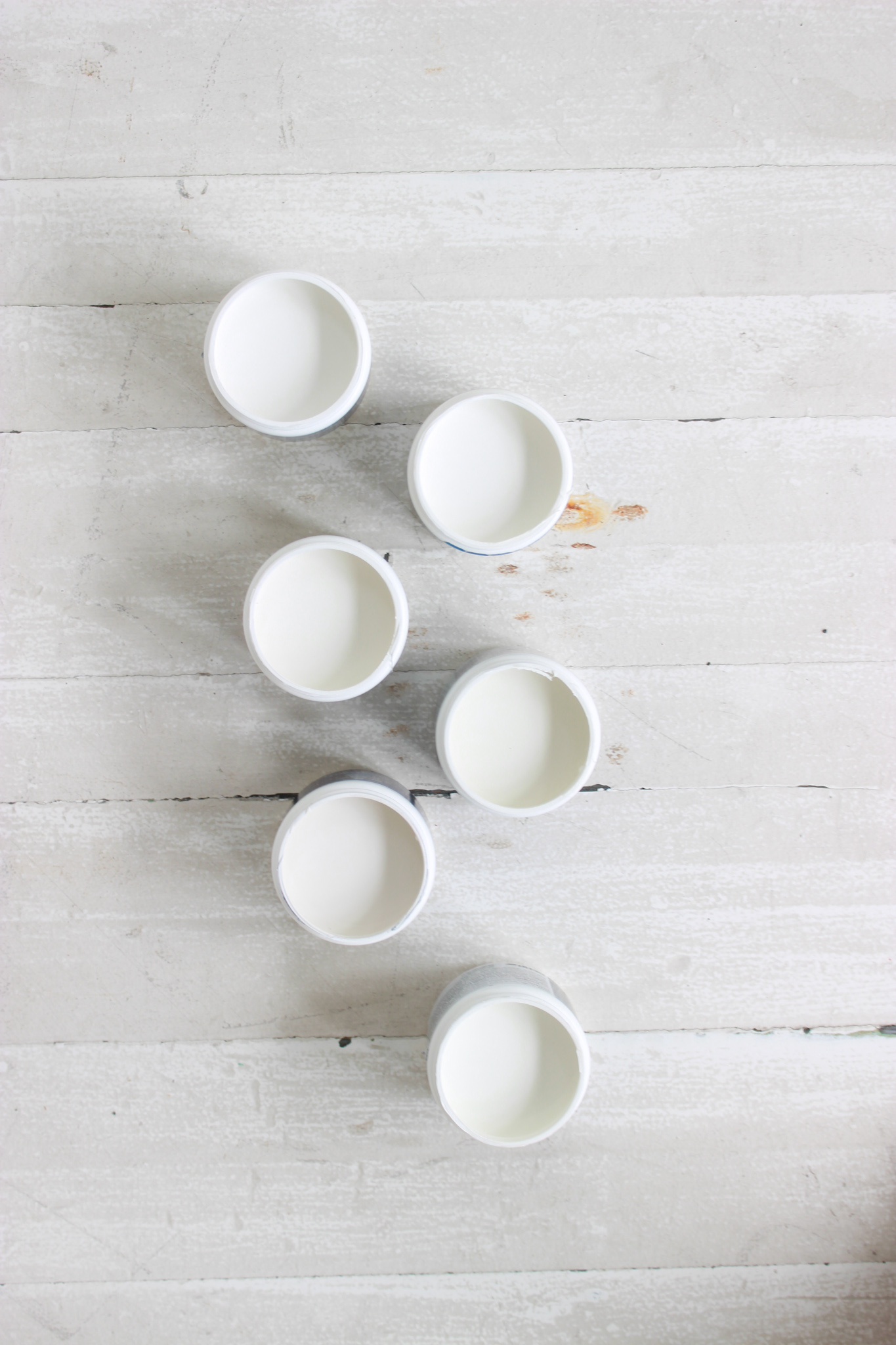
Wanting the endorsement of a widely-loved paint color, I looked up Benjamin Moore's most popular white paints, got a sample of each, and tested them out on our new porch.
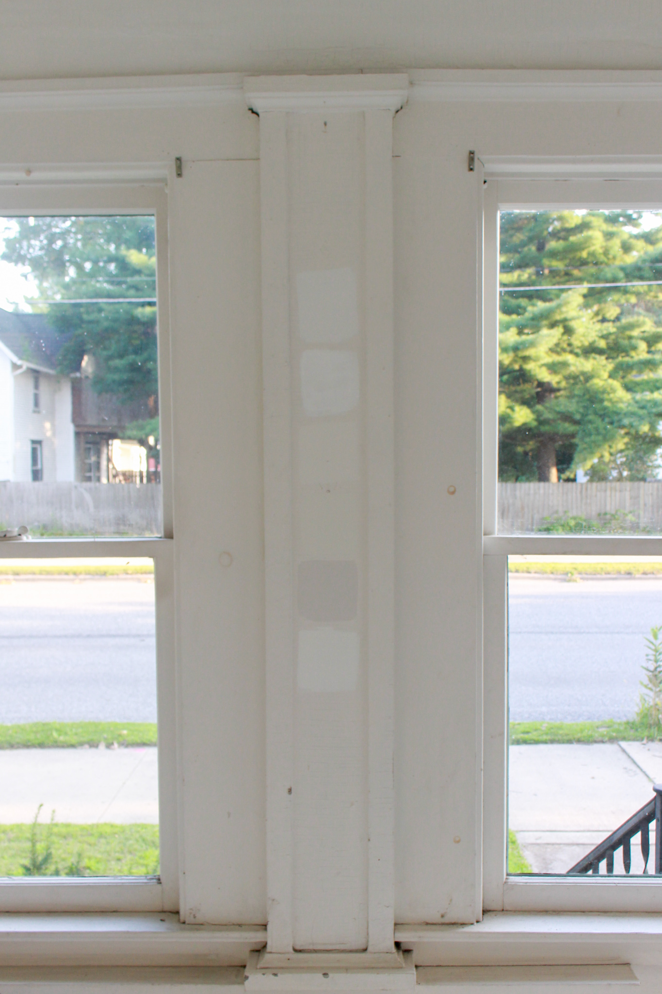
cloud white | chantilly lace | white dove | swiss coffee | white heron | simply white
Important Paint Terms
There are a couple of important terms that are helpful to know before looking at the specific colors.
Light Reflectance Value (LRV) - A color's LRV is a measure of how much light it reflects. The scale runs from 0% (a true black), to 100% (a true white). The higher the number, the more reflective the color.
Undertone - Undertone is the underlying color that can become more visible in certain lighting and depending on the surrounding colors. Any time multiple colors are mixed to make a paint, the resulting color will have an undertone.
For example, a moss green (made of green + yellow) will have a yellow undertone.
Undertones are an especially important consideration when looking at neutral paints, as they are generally composed of red, green, and blue tints that can make them appear yellow, purple, green, blue, etc. depending on the setting.
Warm vs. Cool - A white paint's undertone will determine whether it leans warm or cool.
Warm whites have yellow, orange, or red undertones. They typically make rooms feel cozy.
Cool whites have green, blue, or purple undertones. They can make rooms feel fresh, clean, and bright.
Benjamin Moore's Best Selling White Paints
Talking about these in the order they're painted in.
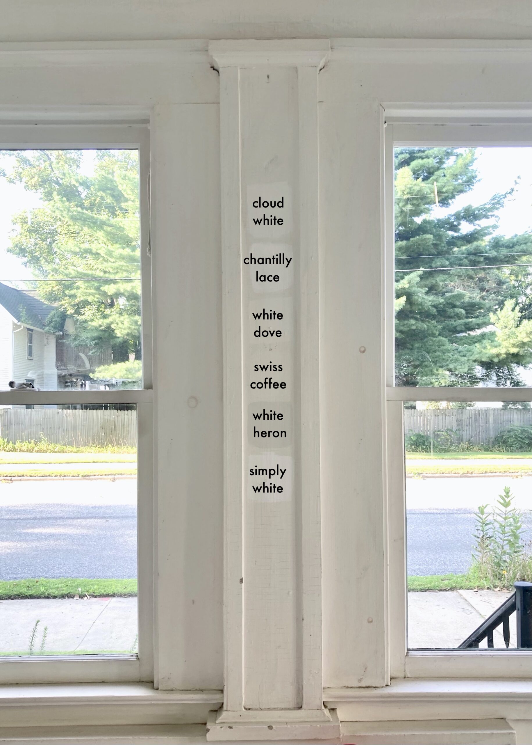
Cloud White
LRV 87.35
Very subtle yellow undertones. Looks neutral with just a hint of warmth. I liked this in all lightings as a nice white that was bright and fresh without being stark.
Chantilly Lace
LRV 92.2
A crisp, bright white. It has very, very faint yellow and green undertones, but so little color is added that they are hardly discernible. The highest LRV of all the whites on this list, which makes it the brightest.
White Dove
LRV 85.38
This is a very widely loved, all-purpose white. People swear by it as the perfect creamy white. The undertones are solidly yellow, making this a warm, creamy white.
Swiss Coffee
LRV 83.93
Yellow and green undertones, which can come out more depending on the surrounding colors and lighting. I'd say this leans slightly more warm than cool, but is close to being neutral. The lowest LRV on this list, so a good option if you don't want too bright a white.
White Heron
LRV 88.85
This one did not even look white to me! Though I could see it being brighter over a larger surface area. Yellow and green undertones. Can read warm OR cool depending on the lighting and surrounding colors. A sophisticated color with a lot of depth!
Simply White
LRV 91.7
A perfect name because it is just simply white. Bright and fresh, but slightly toned down from Chantilly Lace. Yellow undertones with a hint of green. This is almost totally neutral, but I did notice a warm undertone in some lighting.
I loved all of these for different reasons and part of me wants to find a place for each of them in our new home!
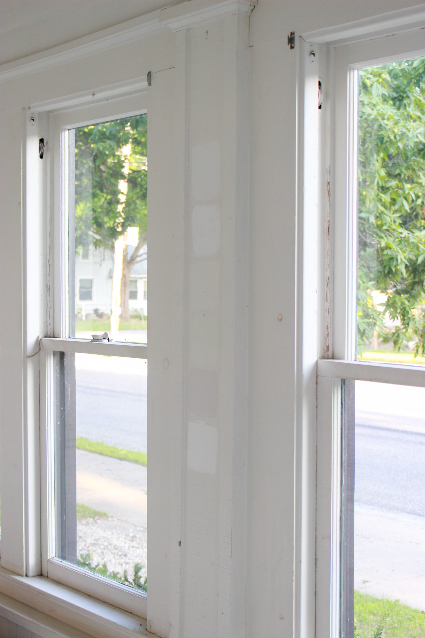
For the porch, I chose (drum roll, please...) Cloud White. It was in my top 3 in all lightings and seemed like a good balance of fresh, neutral, and not too bright in a room that gets lots of natural light. It's currently up on the walls and I cannot get enough of it! Just have the floors left to paint. Stay tuned!
April Daisy says
I study and speak on colors. I love how you chose your process for white and explained it. There really are so many variations and settings to decide which is the right shade/hue of any color. Yay for you sorting through, giving yourself time with them, and choosing a win-win for yourself! Cheers!